So, I got this idea stuck in my head a while back – “iconic jerseys.” You know, the ones everyone recognizes, the ones that mean something. My first thought was pretty simple: I’ll just dig around, maybe make a list of the top ones, figure out what makes them tick. Easy, right?
Well, I started poking around. And let me tell you, it was like opening a can of worms. Everybody and their brother has an opinion on what’s “iconic.” Some folks say it’s all about the championships won in it. Others say it’s the legendary player who wore it. Then you got the design purists who talk about color schemes and logos. It felt like trying to nail jelly to a wall.
My Own Little Jersey Fiasco
It actually reminded me of this time, a few years ago, when I volunteered to help get new jerseys for my kid’s local basketball team. They were just a bunch of under-12s, not exactly pros, but I thought, “Hey, let’s make ’em look sharp! Something memorable, you know?” I had these grand visions of creating a mini-iconic look for our neighborhood champs.
What a disaster.
First, the committee meetings. Oh boy. One parent wanted something “modern and edgy,” another wanted “classic and traditional.” Then came the color debates – should we stick to the old club colors that frankly looked like mud, or try something new? Someone suggested neon green. Neon. Green. For basketball. I spent hours sketching ideas, trying to find a compromise. We looked at dozens of templates. We argued about fonts. The budget was tiny, which didn’t help. In the end, after weeks of back and forth, we ended up with something super bland and generic, just to stop the arguments. The “iconic” dream? Dead on arrival. It was just a relief to have any jerseys at all.
Back to the Real Deal
And that whole mess got me thinking differently about the actual iconic jerseys out there. They don’t just pop into existence because someone had a cool design idea one afternoon. It’s not like a committee sat down and voted “this one will be iconic.” It’s way more complicated than that.
So, I changed my approach. My “practice” wasn’t about finding the “best” or making a definitive list anymore. That felt impossible and, honestly, a bit boring after my little league design adventure. Instead, I started to just explore. I’d pick a jersey that a lot of people seem to agree is special, and then I’d just dive in.
My process kind of looks like this now:
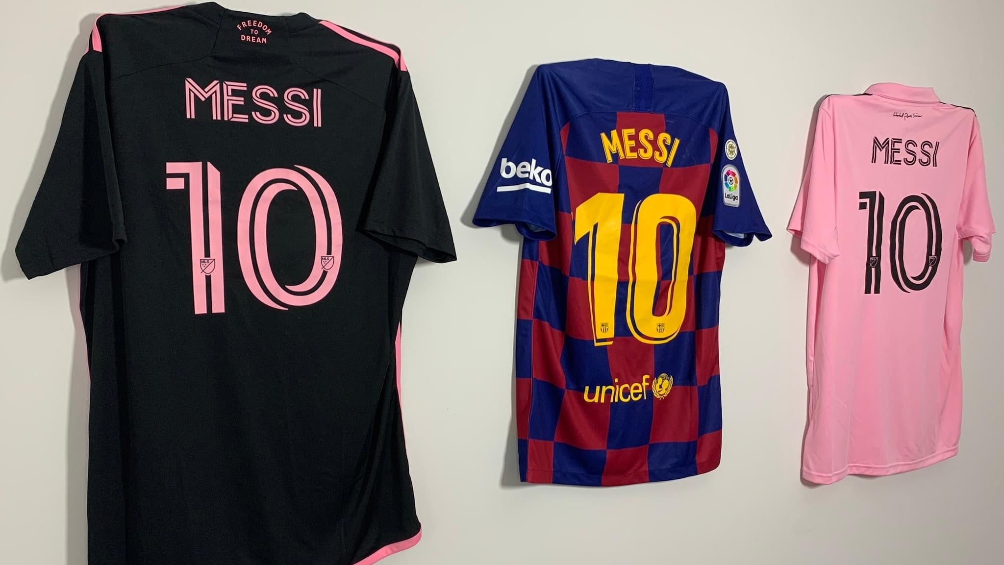
- Pick a contender: Something like, say, the old Chicago Bulls pinstripes, or maybe a classic soccer kit, like Brazil’s yellow.
- Dig into the history: When did it first appear? Were there changes over time?
- The big moments: What happened when that jersey was on the court or pitch? Famous wins? Unforgettable plays?
- The players: Who were the legends that made it famous? Did their personality match the jersey’s vibe?
- The look itself: Was the design groundbreaking for its time? Simple? Bold?
- The feeling: This one’s harder to pin down. But what did it feel like to see that jersey? What does it make people remember?
What I’ve found is that it’s usually a mix of all these things. Sometimes it’s a dynasty, pure and simple. Other times, it’s a single incredible player who transcended the game. And sometimes, yeah, the design itself was just so darn perfect for its era that it stuck. There’s no magic formula.
So, my “record” of iconic jerseys isn’t a neat, tidy list. It’s more like a scrapbook of stories, moments, and why these pieces of fabric ended up meaning so much to so many people. It’s an ongoing thing, and every time I look into another one, I learn something new. It’s less about an endpoint and more about appreciating how these things earn their stripes, so to speak.

