
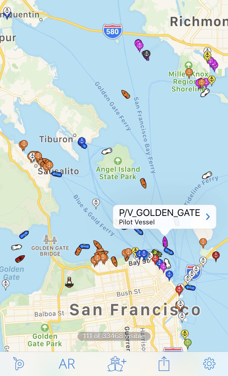
Alright, so I wanted to chat a bit about a little project I got myself into recently – trying to really get a handle on a depth chart for San Francisco Bay. Not just the pretty ones you see, but something I could tinker with myself.
Getting Started with the Idea
You know how it is, I spend a good chunk of my time around the Bay, maybe on a boat, maybe just wondering what’s down there. I got this itch to see the underwater landscape, the channels, the flats, all of it. Figured, how hard could it be, right? Famous last words, sometimes.
The Hunt for Data
First thing, I went looking for the actual depth data. My brain immediately went to, “The government must have this stuff!” And yeah, they do. Places like NOAA are goldmines, but it’s not like they just hand you a ready-to-go Google Map of the bay floor. Oh no. It’s usually raw data files, sometimes in formats that make your eyes water. I remember downloading a few sets and just staring at the file names, thinking, “Okay, what now?”
It was a bit of a digital scavenger hunt. I poked around on different websites, trying to find bathymetric data – that’s the fancy term I picked up for underwater depths. Some sites were easy, others felt like navigating a maze designed in 1998.
Wrestling with the Tools
Once I had some data that looked promising, the next step was figuring out how to actually see it. It’s not like you can just double-click a depth data file and it pops up like a picture. I knew I’d probably need some kind of mapping software. I tried a few things.
- Some online viewers were okay for a quick look, but I wanted more control.
- Then I looked at some specialized GIS (Geographic Information System) software. Man, some of that stuff is complex. Felt like I needed a degree just to import a file.
I eventually settled on trying to get it working with QGIS. It’s free, which is a big plus, and super powerful. But, let me tell you, it’s got a learning curve like a steep hill. I spent a good amount of time just watching tutorials and reading forums, trying to figure out the basics.
The Nitty-Gritty Process
So, I had my data – a bunch of numbers representing depths at different points. And I had my tool, QGIS. The next part was the actual work. Getting the data into QGIS was the first hurdle. Sometimes it worked, sometimes it threw errors I didn’t understand. Patience, I told myself, lots of patience.
Then it was about trying to make sense of it. How do you turn a cloud of depth points into something that looks like a chart? There were steps like:
- Creating a raster, which is like a grid image, from the points.
- Figuring out the right color schemes. You want deep water to look different from shallow water, obviously. This took a surprising amount of fiddling. Dark blues for deep, lighter blues or greens for shallows – trying to find something that looked right to my eye.
- Dealing with projections. This is a sneaky one. It’s about making sure your map data lines up correctly with the real world. Get it wrong, and things can look stretched or squished.
It wasn’t a smooth ride. There were definitely moments I wanted to just give up. Things wouldn’t display, layers would be invisible for no reason I could see, or the whole program would just decide to take a break. Classic tech fun.
Seeing it Come Together
But then, bits and pieces started to click. I’d get a layer to display correctly, and suddenly, I could see the outline of the bay’s deeper channels. Or I’d adjust the colors, and the shallow mudflats would pop out. Those little victories kept me going. It was pretty cool to see the actual structure of the bay floor emerge from all that raw data.
I managed to get a decent visualization put together. I could clearly see the main shipping channel carving its way under the Golden Gate Bridge and up into the bay. I could spot the shallower areas near the shorelines, the distinct drop-offs. It’s one thing to know they’re there, it’s another to actually see the shape of them based on real data I’d processed.
What I Ended Up With (and What I Learned)
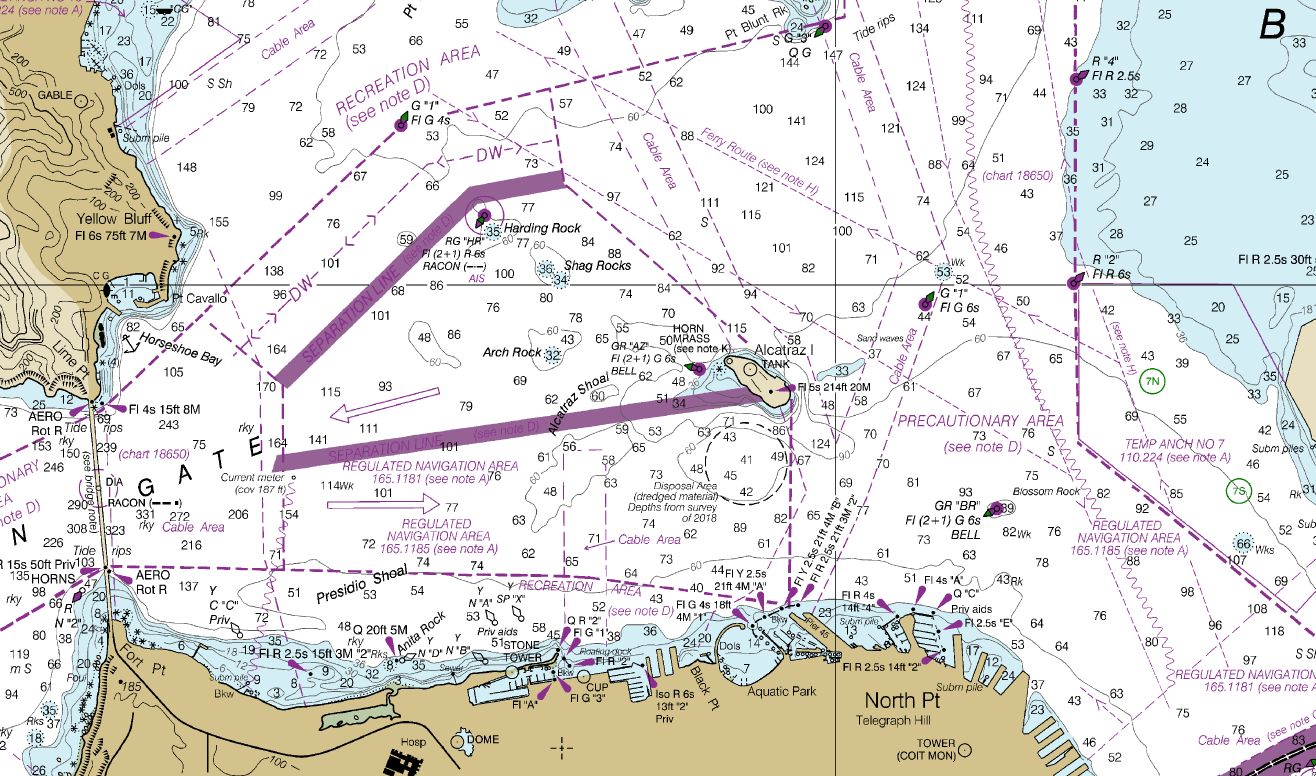
So, what’s the final result? I’ve got my own, custom-rendered depth visualization of the San Francisco Bay. Is it an official navigation chart? Absolutely not! I wouldn’t trust my boat to it. For that, you always use the real, certified charts. But for my own curiosity, for getting a better feel for the underwater terrain? It’s fantastic.
This whole thing was a good learning experience. It wasn’t just about the Bay’s depth; it was about the process. Finding data, wrestling with software, and the satisfaction of making something yourself, even if it’s a bit rough around the edges. It also gave me a new appreciation for the folks who make those official charts – it’s a ton of work!
If you’re thinking of trying something similar for your local waters, my advice is just to dive in and be prepared to tinker. It can be frustrating, but it’s also pretty rewarding when you start to see the shapes emerge from the numbers.
